WRITINGUW-031
8 CSS Interaction Properties Every Developer Should Know
Scroll Snap
Scroll Snap enables content on a webpage to "snap" into place when users scroll, creating a more intuitive scrolling experience. It’s especially useful for carousels or sections of a webpage that need to stay aligned after scrolling. Scroll Snap works by defining specific scroll positions for elements within a scrollable container. Key properties include scroll-snap-type and scroll-snap-align.
scroll-snap-type: This property sets the scroll snapping behavior for the container. It accepts values likex,y, orblock, as well asmandatoryorproximity, which determine the snapping axis and how strictly the container adheres to snap points. More examples on MDN.scroll-snap-align: Applied to child elements, this property defines their alignment within the scrollable area. Common values includestart,center, andend, determining the alignment when snapping. MDN example.
.container {
  scroll-snap-type: y mandatory;
}
.item {
  scroll-snap-align: center;
}
In this example, the container snaps its items to the center along the vertical axis (y). As users scroll, the content automatically aligns to the nearest snap point.
Overscroll Behavior
overscroll-behavior controls how scrollable elements behave when reaching their scroll boundary. It can prevent default browser actions like bounce effects or scrolling the entire page when a scrollable container reaches its edge. This is particularly useful for creating a better scrolling experience in single-page applications.
The property accepts auto, contain, and none. auto retains default behavior, contain prevents scroll overflow from propagating, and none fully disables scroll chaining.
.modal {
  overflow-y: auto;
  overscroll-behavior-y: contain;
}
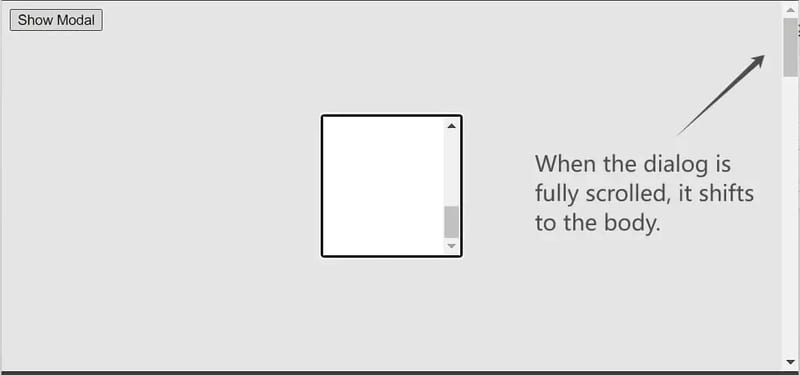
In this example, when users reach the scroll boundary of a modal window, overscroll-behavior: contain prevents scrolling from affecting the page outside the modal. This is especially useful for controlled scrolling behavior in modals or sidebars.
To prevent Chrome on Android from refreshing the page when scrolling past the top, set this on the html element:
html {
  margin: 0;
  overscroll-behavior: none;
}
Scrollbar Gutter
When using overflow: auto, a scrollbar appears when content overflows, potentially causing layout shifts. This can negatively impact text readability. The scrollbar-gutter property allows you to reserve space for the scrollbar, avoiding unnecessary visual shifts.
Common values include auto, stable, always, and both. auto provides default behavior, stable ensures space for the scrollbar even when it's not visible, and always keeps the scrollbar visible, preventing layout changes.
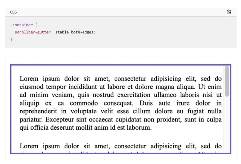
Note that the gutter itself doesn’t have a color—it’s set to gray here for differentiation. Additionally, the second optional parameter, both-edges, allows you to create symmetrical gutters on both sides.
Overflow Anchor
overflow-anchor helps control scroll anchoring behavior within scrollable elements, preventing unwanted scroll jumps. Scroll anchoring adjusts the scroll position to keep dynamic content visible, such as appearing numbers.
It accepts auto (default) and none. auto allows the browser to adjust the scroll position as needed, while none disables this behavior, keeping the scroll position fixed when content loads dynamically.
.content {
  overflow-anchor: none;
}
By default, scroll anchoring is enabled in supported browsers. The code above disables this behavior, preventing changes in scroll position when dynamic content is added. This is useful in interactive applications like chat apps, where new messages shouldn't change the user's scroll position.
Touch Action
touch-action controls how touch gestures interact with elements on touch devices. It determines whether the browser's default behavior (like zooming and scrolling) is triggered, or if events are passed directly to JavaScript for custom handling. This property is essential when creating custom touch interactions without interfering with standard gestures (like pinch-to-zoom or double-tap).
The property includes values like auto, none, pan-x, pan-y, manipulation, and their combinations.
auto: The default behavior where the browser handles touch events, allowing scrolling and other gestures.none: Disables all touch gestures, making elements respond only to JavaScript touch event handling.pan-x/pan-y: Restricts scrolling to horizontal (pan-x) or vertical (pan-y) directions.manipulation: Allows gestures like pinch-to-zoom but blocks other touch behaviors.
.slider {
  touch-action: pan-y;
}
In this example, the touch-action property allows vertical scrolling gestures while blocking horizontal ones, useful for vertically scrolling elements to ensure that horizontal swipes don’t interfere.
Scroll Timeline & View Timeline
scroll-timeline and view-timeline are new CSS features that enable animating elements based on user scroll behavior, creating more dynamic animations that respond to user interactions.
- Scroll Timeline:
scroll-timelinelinks animations to the scrolling of a page or element. As users scroll, elements can smoothly change appearance or position based on scroll progress. - View Timeline:
view-timelineallows elements to animate based on their position relative to the viewport, such as creating fade-in effects when elements enter the screen.
This can replace the use of JavaScript libraries, offering better performance. However, browser support is currently limited on Firefox and Safari. Check Can I use for details.
scroll-timeline includes a custom timeline name (prefixed with -- to avoid conflicts) and a scroll axis direction.
#container {
  scroll-timeline: --custom_name_for_timeline block;
}
You can then reference the name in the animation-timeline declaration to specify which container element drives the animation progress through scrolling.
#item {
  animation-name: rotateAnimation;
  animation-timeline: --custom_name_for_timeline;
}
View a live example.
view-timeline includes two values — a named View Progress Timeline name and an optional scroll axis value. Then, reference this name in the animation-timeline declaration to animate elements based on the timeline.
.animation {
  view-timeline: --subjectReveal block;
  animation-timeline: --subjectReveal;
  animation-name: appear;
}
Check out this live example.
View Transition API
The View Transitions API provides a way to create smooth animations between different views of a website. This includes animating between DOM states in Single Page Applications (SPA) or creating animations between document navigations in Multi-Page Applications (MPA). Here is an online example.
This effect is commonly seen on mobile but can create a more native user experience on the web. It helps reduce cognitive load, keeping users in context, and minimizes perceived loading delays when navigating between states or views in an application.
The JavaScript API revolves around document.startViewTransition(callback), where callback typically updates the DOM to the new state.
document.startViewTransition(() => updateTheDOMSomehow());
document.startViewTransition captures a screenshot of the current DOM before invoking the callback. Once complete, the browser transitions between the initial screenshot and the updated version.
For more details, refer to this article and MDN introduction.
If you found this helpful, consider subscribing to my newsletter for weekly web development insights and updates. Thanks for reading!