WRITINGUW-020
7 Advanced CSS Layout Properties Every Developer Should Know
This article introduces some CSS layout properties you may not be familiar with, including CSS Writing Modes, CSS Logical Properties, Dynamic Viewport Units, Media Queries Range, @container style/size queries, Anchor Positioning, and Break Rules.
CSS Writing Modes
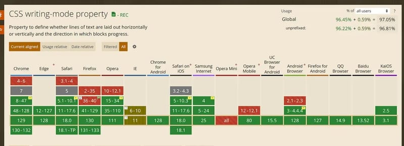
The writing-mode property in CSS sets whether text lines are laid out horizontally or vertically and the block's progression direction. When setting this for the whole document, it should be applied to the root element (i.e., the html element of the HTML document).
/* Keyword values */
writing-mode: horizontal-tb;
writing-mode: vertical-rl;
writing-mode: vertical-lr;
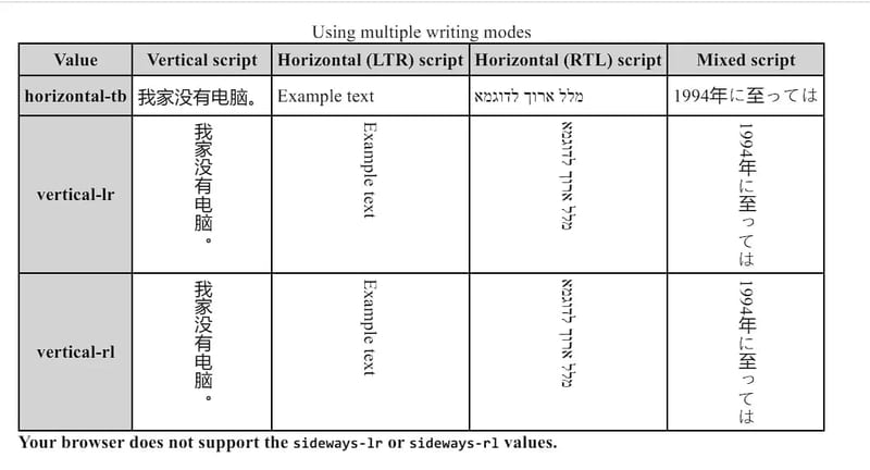
This property can be set for left-to-right (LTR, like English and most other languages) or right-to-left (RTL, like Hebrew or Arabic).
Here’s a clear comparison:
CSS Logical Properties
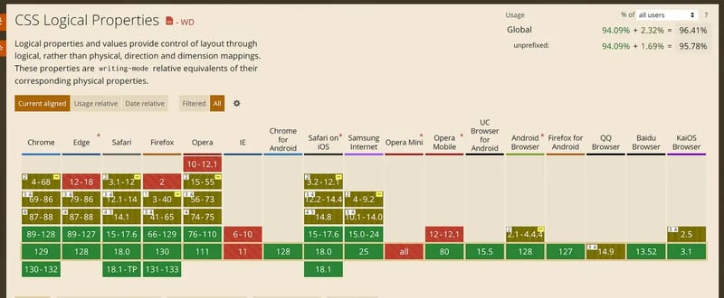
CSS Logical Properties provide a set of properties based on the document's content flow direction, rather than the physical direction used in traditional properties (like left, right). They automatically adapt to different writing modes, such as left-to-right (LTR) or right-to-left (RTL) languages.
margin-block-start vs. margin-top
The margin-block-start CSS property defines the logical block start margin, which maps to the physical margin depending on the writing mode, directionality, and text orientation.
margin-block-start: Sets the margin at the block start. In horizontal writing modes (LTR), it's equivalent to margin-top, but in vertical writing modes, it adjusts based on the edge.
It corresponds to margin-top, margin-right, margin-bottom, or margin-left depending on the values of writing-mode, direction, and text-orientation.
Related properties include margin-block-end, margin-inline-start, and margin-inline-end, which define other margins for the element.
padding-inline-end vs. padding-right
Similarly, for padding, the padding-inline-end sets the padding for the inline end position. In LTR modes, it's equivalent to padding-right, but in RTL modes, it's equivalent to padding-left.
border-inline-start vs. border-left
For borders, the border-inline-start defines the border at the inline start position. In LTR writing modes, it's equivalent to border-left, while in RTL modes, it becomes border-right.
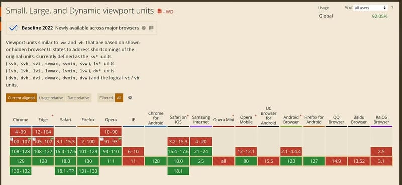
Dynamic Viewport Units (lvh, lvw, lvmin, lvmax vs. vh, vw)
The traditional vh and vw units define sizes as a percentage of the viewport. For example, "100vh" is 100% of the viewport height, and "50vw" is 50% of the viewport width.
However, the problem with vh and vw units is that your app doesn't always have access to the full viewport, especially on mobile devices, where browser controls (like the address bar) take up space. This means a "100vh" element can overflow, causing part of the content to be hidden when browser controls are visible. You could work around this with height: calc(100vh - <location bar height in px>), but that could break if the browser updates.
Now, this issue can be solved with new viewport units:
- Small viewport (
svh,svw,svmin,svmax): These units provide the height, width, minimum, and maximum dimensions of the viewport when the browser chrome is visible (e.g., on page load or after scrolling to the top). - Large viewport (
lvh,lvw,lvmin,lvmax): These units represent the viewport when the browser chrome is hidden (e.g., after scrolling down the page). - Dynamic viewport (
dvh,dvw,dvmin,dvmax): These units dynamically switch between the small or large viewport, depending on whether the browser chrome is visible. This means it useslvhwhen the address bar is hidden andsvhwhen it's visible.
The dynamic viewport is the most useful. Here's an example of adjusting the page size based on browser UI changes:
.body {
  height: 100dvh;
}
Small and large viewport units also have their use cases. For instance, adjusting font sizes based on viewport size, such as setting headings to 10svh, ensures text doesn't scale too much when users enter fullscreen.
Media Queries Range Contexts
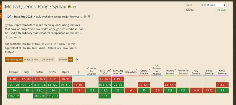
Media query range contexts allow developers to define responsive conditions more intuitively, using simple syntax for defining a range, instead of writing multiple complex media queries.
Here's the traditional syntax:
@media (min-width: 400px) and (max-width: 1000px) {
  /* Styles apply between 400px and 1000px viewport width */
}
With range context, you can now write:
@media (400px < width < 1000px) {
  /* Range context */
}
@container Style/Size Queries
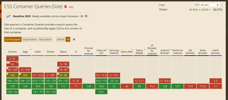
The @container rule allows queries based on the container's size or style, making styling more flexible instead of relying on viewport size. This means the condition is reevaluated when the container's size or <style-feature> changes.
Here's the syntax:
@container <container-condition> {
  <stylesheet>
}
Examples:
@container <container-condition># {
  <stylesheet>
}

/* Example usage of a basic container query */
@container (width > 400px) {
  h2 {
    font-size: 1.5em;
  }
}

/* You can set a container name and apply styles only to containers matching that name */
.post {
  container-name: sidebar;
  container-type: inline-size;
}
/* Or use the shorthand syntax */
.post {
  container: sidebar / inline-size;
}

/* Example with an optional <container-name> */
@container sidebar (height > 30rem) {
  h2 {
    line-height: 1.6;
  }
}

/* Multiple queries in a single condition */
@container (width > 400px) and style(--responsive: true) {
  h2 {
    font-size: 1.5em;
  }
}
While traditional media queries target the entire viewport, @container only applies to a specific container, making it especially useful for component-based development and responsive layouts.
Anchor Positioning
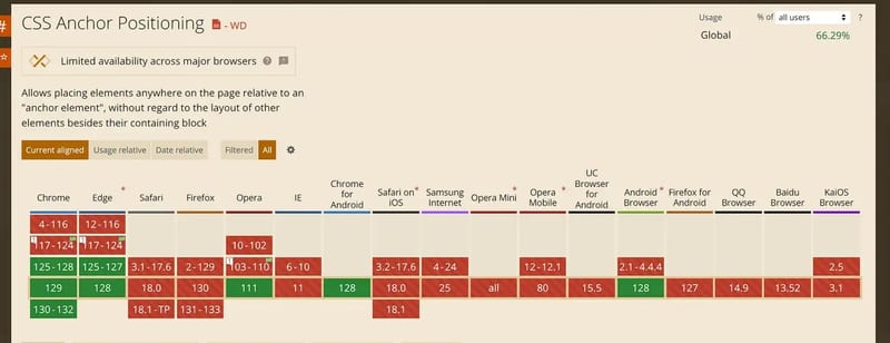
Anchor positioning lets you connect elements together so they can adjust based on each other. Some elements are defined as anchor elements; other elements can be positioned relative to them.
This is useful for dynamic positioning, such as menus, tooltips, selects, labels, and settings dialogs, eliminating the need for third-party libraries.
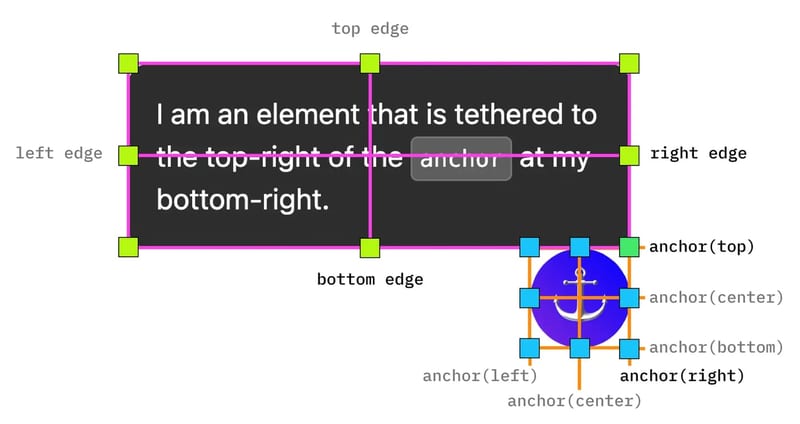
For example, you can define an anchor name with anchor-name, and other elements can position themselves relative to it:
.slider-link {
  anchor-name: var(--anchor1); /* Define an anchor */
}

/* Other elements can position themselves relative to the anchor */
.related-element {
  position-anchor: --anchor1;
  position: absolute;
  right: anchor(right);
  bottom: anchor(top);
}
More details on web.dev.
Break Rules
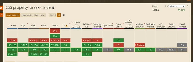
Break rules control how elements break across pages, columns, frames, or text regions, especially useful in print layouts or complex multi-column layouts. These rules give developers more control over text flow in paginated or constrained layouts.
The three properties are break-after, break-before, and break-inside.
break-after sets how breaks should behave after a generated box. If no box is generated, the property is ignored. break-before applies similarly but before the box.
break-after: auto; /* Allows a break after the box */
break-after: avoid; /* Avoids breaks after the box */
break-after: always; /* Forces a break after the box */
break-after: all; /* Forces a break in all contexts */
break-inside controls whether elements can break inside, preventing content from splitting across columns or pages.
break-inside: auto; /* Allows breaks inside */
break-inside: avoid; /* Avoids breaks inside */
break-inside: avoid-page; /* Avoids page breaks inside */
break-inside: avoid-column; /* Avoids column breaks inside */
If you found this helpful, consider subscribing to my newsletter for weekly web development insights and updates. Thanks for reading!