WRITINGUW-033
8 Advanced CSS Typography Properties Every Developer Should Know
CSS offers powerful typography tools that help developers create more refined and readable web designs. In this article, we'll explore some lesser-known but potentially useful CSS properties.
1. font-variant
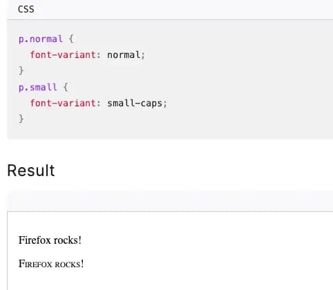
The font-variant property provides developers with robust control over font variants. Its primary use is to adjust the display of text to better fit specific design needs. A common application is to create small caps (small-caps), often used in formal settings where uppercase letters need to appear without being overly prominent.
In fact, font-variant is a shorthand for several other CSS properties:
- font-variant-alternates
- font-variant-caps
- font-variant-east-asian
- font-variant-emoji
- font-variant-ligatures
- font-variant-numeric
- font-variant-position
For example, font-variant-ligatures manages how ligatures appear, while font-variant-east-asian deals with special character forms in East Asian fonts. This is particularly useful in multilingual projects where font usage can vary significantly across cultures.
2. initial-letter
The initial-letter property allows developers to create enlarged and sunken first letters, a design style commonly seen in print media like books and magazines where the first letter spans multiple lines to draw the reader's attention.
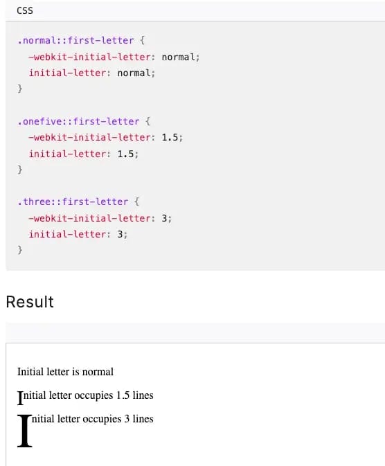
In web design, initial-letter can add visual interest to otherwise plain paragraphs, making it especially suited for long articles or blog content. By specifying the number of lines and height the letter occupies, you can achieve customized effects.
You can also combine this with font-weight to make the letter more visually striking. This property works for text in various languages, including those that emphasize the first letter, like French or German.
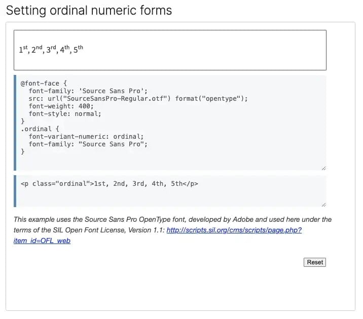
3. font-variant-numeric
The font-variant-numeric property gives you detailed control over how numbers are displayed, which is particularly useful when handling financial, scientific, or statistical data. Normally, numbers are displayed in proportional fonts (each digit having a different width), but sometimes you need monospaced digits to align numbers in tables, invoices, etc. This property supports several subproperties, including lining-nums, oldstyle-nums, proportional-nums, and tabular-nums.
For instance, in a financial report, using tabular-nums ensures that all digits occupy the same width, preventing misaligned figures.
If you're designing something with a historical feel, you might choose oldstyle-nums to display traditional numeral forms. These subtle typographical details may go unnoticed by the average user, but they contribute significantly to improving interface aesthetics and user experience.
4. font-display
The font-display property optimizes the loading experience of custom fonts. Typically, when using custom fonts, browsers wait until the font is fully loaded before displaying text. font-display controls this behavior, enhancing page performance and improving user experience. Key options include auto, block, swap, fallback, and optional. For example, swap shows system fonts while custom fonts load, and switches to the custom font once available, avoiding the "Flash of Invisible Text" (FOIT).
@font-face {
  font-family: 'MyCustomFont';
  src: url('mycustomfont.woff2') format('woff2');
  font-display: swap;
}
Additionally, font-display can specify fallback fonts if the custom font fails to load, ensuring the text remains visible. The use of font-display also benefits SEO since page speed is a ranking factor in search engines.
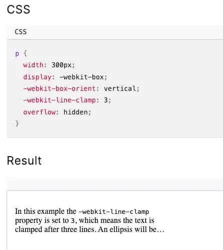
5. line-clamp
line-clamp is a CSS property used for truncating multi-line text, limiting the number of lines displayed, with the overflow hidden and replaced by ellipses. This is especially useful for displaying content previews or article summaries.
Using -webkit-line-clamp, developers can set the maximum number of text lines and control the overflow in conjunction with overflow and display: -webkit-box. This property is crucial in responsive design, as it helps manage long content on different screen sizes without breaking layouts.
6. font-palette
The font-palette property allows developers to customize color palettes for variable fonts, adapting the fonts to different design styles or themes.
Possible values:
- normal: Uses the font's default palette. Most fonts come with a base color scheme suitable for general use.
- light: Applies a light color palette to the font, ideal for dark-themed designs where clearer text is required.
- dark: Uses a dark palette, typically for enhancing contrast on light backgrounds.
<palette-identifier>: Selects a specific palette number from the available palettes within a variable font.palette-mix(<base-palette>, <override-palette>, <ratio>): This advanced option allows for blending two palettes, with<ratio>controlling the mix. This flexibility enables developers to create custom color effects tailored to their design needs.

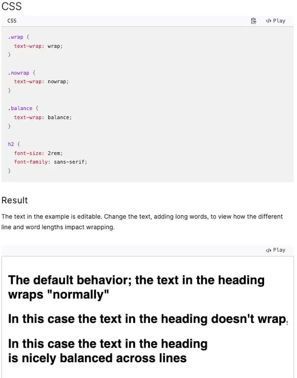
7. text-wrap
The text-wrap property controls how text breaks when encountering long words or unbreakable content, providing more options for determining line breaks. This ensures balanced text across different screen sizes and layouts.
It’s a shorthand for text-wrap-mode and text-wrap-style. The default wrap option handles line breaks at appropriate points, preventing overflow. On the other hand, nowrap forces the text to stay on a single line, often used for elements like navigation bars or buttons.
For more refined typographic control, the balance option distributes characters evenly across lines, making the text look more orderly. This is ideal for shorter passages (typically fewer than six lines). The pretty option works similarly to wrap but uses a more complex algorithm to achieve better line-breaking, especially in long texts, reducing the occurrence of "widows" (lines that dangle at the end of a paragraph).
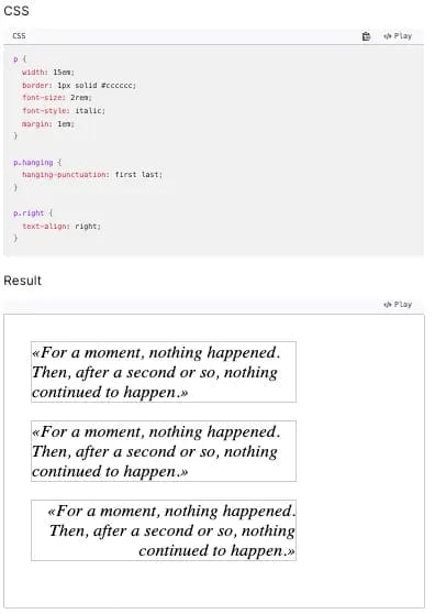
8. hanging-punctuation
The hanging-punctuation property manages how punctuation is aligned, allowing punctuation marks to hang outside the text box. This is useful for improving the alignment and aesthetics of text.
The none value is the default, where punctuation remains inside the text box. The first value allows punctuation at the beginning of a line to hang outside, making the text look neater. For end-of-line punctuation, force-end pushes the punctuation outside, while allow-end gives more flexibility, allowing but not requiring it to hang.
If you found this helpful, consider subscribing to my newsletter for weekly web development insights and updates. Thanks for reading!